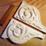
This is probably the last I’ll post about these brackets, until they get included in the larger project. Yes, they can always be made better, but this is enough for now. Have to leave something for the next version. I’m not completely satisfied with the dot punched background. The model I started from used such a background to increase contrast with the leaves, so I did the same. Yet, I’m wondering if the underlying smooth background might have been better. Next time …
The design was borrowed from an article by Frederick Wilbur (pdf) about carving bookends. The side faces of the bookends were just what I wanted. We’ll save the fish scales for some other day.
Leave a Reply