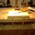
 That Bench on Bench was built with good reason. Here’s the start of a new journey: lettercarving.
Hand carved lettercarving. Not machine carved. Not routed.
Signs are such a pervasive part of our everyday existence that we rarely think of how they are made. Most, these days, are computer generated in some way and produced through a variety of automation. Early in Dad’s art career he painted signs: shop window signs, store front signs, signs on trucks, gold leaf signs on bank windows (there’s a lock picking story with one of those banks), signs in every imaginable form. All were hand lettered, with letters of all styles flowing magically off long bristled brushes. There was a certain period when the Interstate Commerce Commission required great long strings of registration numbers be painted on the door of every commercial vehicle. While we detest government regulation, that one found Dad frequently lettering trucks and put a lot of food on our table. About the time that adhesive, die-cut, plastic lettering came along those regulations eased and reduced the need for hundreds of numbers on every truck door. Long stories short, I have an affinity for hand lettering.
Once in a rare while we come upon a sign with three dimensional characters, and on close inspection usually find that it was power routed. Then, far more rarely we find hand carved work from Kari or maybe Chris Pye.
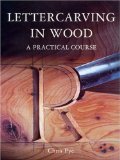
Chris “wrote the book” about hand lettercarving a dozen years ago. It’s out of stock every place I looked in the U.S., and the world’s largest bookseller needed only 3 months to fetch me a copy from the British publisher.
The book is excellent and I’m slowly working my way through it. One thing is certain. There’s not much forgiveness in lettering, especially incised lettering … where the letters are carved into the wood. I’ve been doing lots of incised practice.
Taking a break from practicing incised letter trenches, hundreds and hundreds of them, I did my first raised / relief carving.
About 40 years ago, my wfe swished a paint brush around for 2 seconds to produce this character, a stylized “E” that we have used since. It made a good subject for my first raised letter.
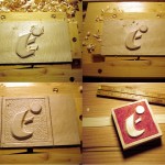 The first cuts were with a 60 degree v-tool, an Ashley Isles tool at it’s original grind. It works very well but has a higher cutting angle than I prefer. I just haven’t screwed up the courage to change it. … and forgot to take a picture just after the outlining.
Next, everything that is not part of the letter is the ground, and the ground is lowered, using #9 and #6 gouges, about 3/32 of an inch. Then it is leveled with a wide #3 gouge.
“Setting in” started up there around the ball. Setting in is the tedious part, the work of carefully setting the edge bevel exactly where it belongs. It needed quite a range of gouges and some very careful trimming with a fishtail chisel that also doubles as a surgery scalpel.
Then, the ground was fine tuned. Grounding in the small space was a challenge. Some of my smaller palm tools helped there.
After that, I stopped and made a simple “froster” by filing spurs into the end of a carriage bolt. You can see the end of it in the lower left photo.
The froster is to texture the background. The first stage is a quick outline with the v-tool. Next, tap the froster all around the edges of the letter, right at the base of the bevels. Then, the rest of the ground is done by keeping the froster suspended about 1/8 inch off the ground and moving it all around while tapping with a hammer. (and trying not to let it get onto the edge framing)
Then, a single coat of clear satin was applied to seal the bevel edges. That was followed by a 320 grit sanding of the letter face and a red acrylic wash on the ground, and trimming to final size.
